
Ethos is a hot yoga studio founded by a dancer and a professional cyclist, both Cambridge scholars. Planning a launch into the competitive London market, they needed a brand identity that would stand out and power a brilliant opening.
“We are insatiably curious and never stop asking questions. We take a strategic approach.”
Through competitive analysis we found the brand's background in science and diagnostics to be genuinely different, and in line with wider trends around self-betterment and education.
Communicate science, intellect, physicality and development. Wanting science without feeling clinical, we looked back to the age of alchemy and its intriguing symbols of fire, purification and gold.
“If you want to make your consumer feel something, you have to know how to translate a brand into an identity.”
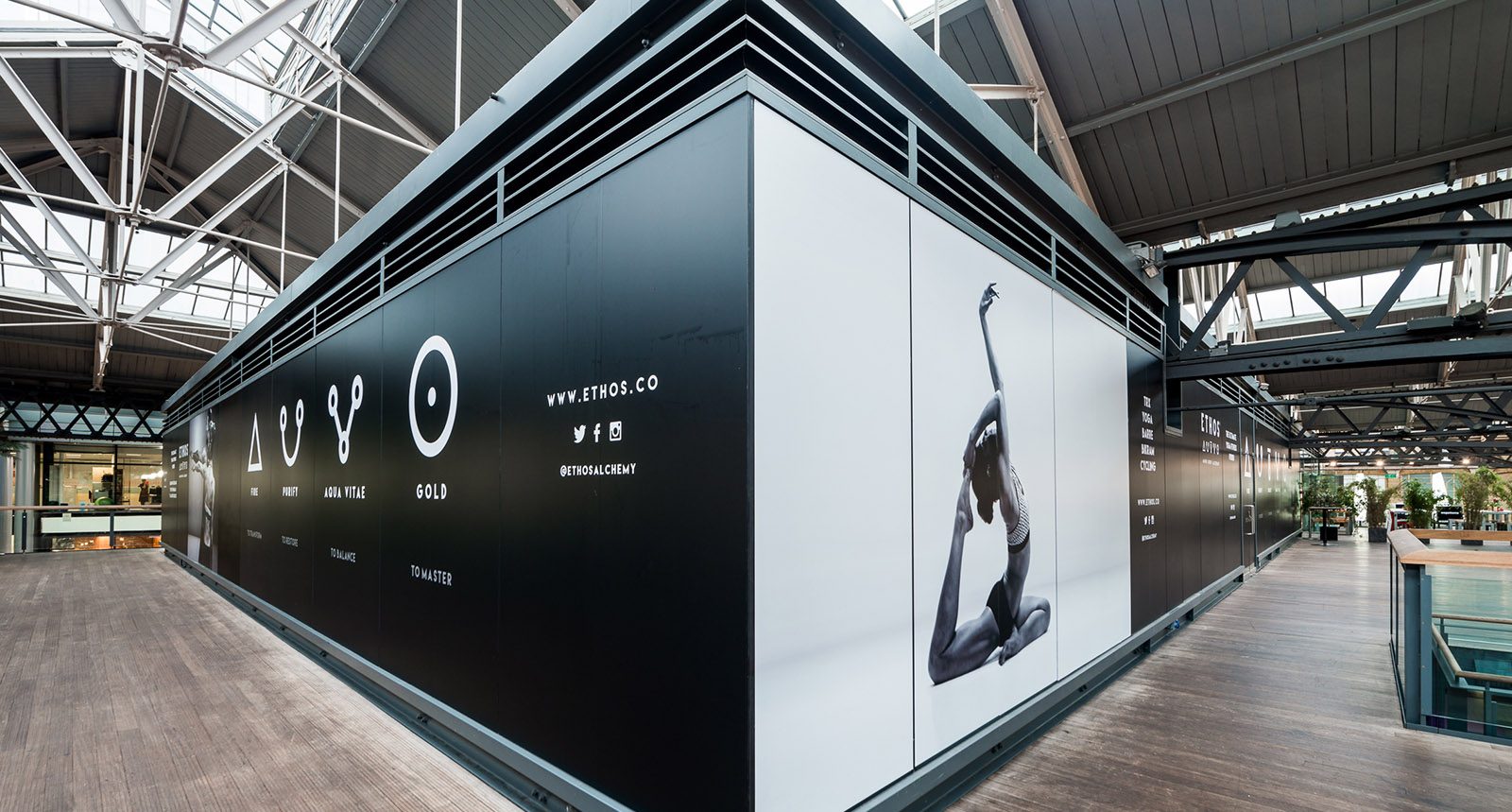
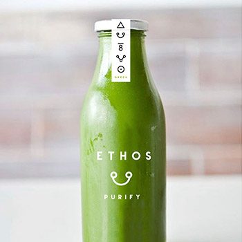
We devised a five-symbol set that formed the basis of the logo. Modernised with a contemporary graphic feel and paired with a bold Ethos wordmark, the identity felt tribal, powerful and iconic, then flowed through the studio space to help people navigate it.
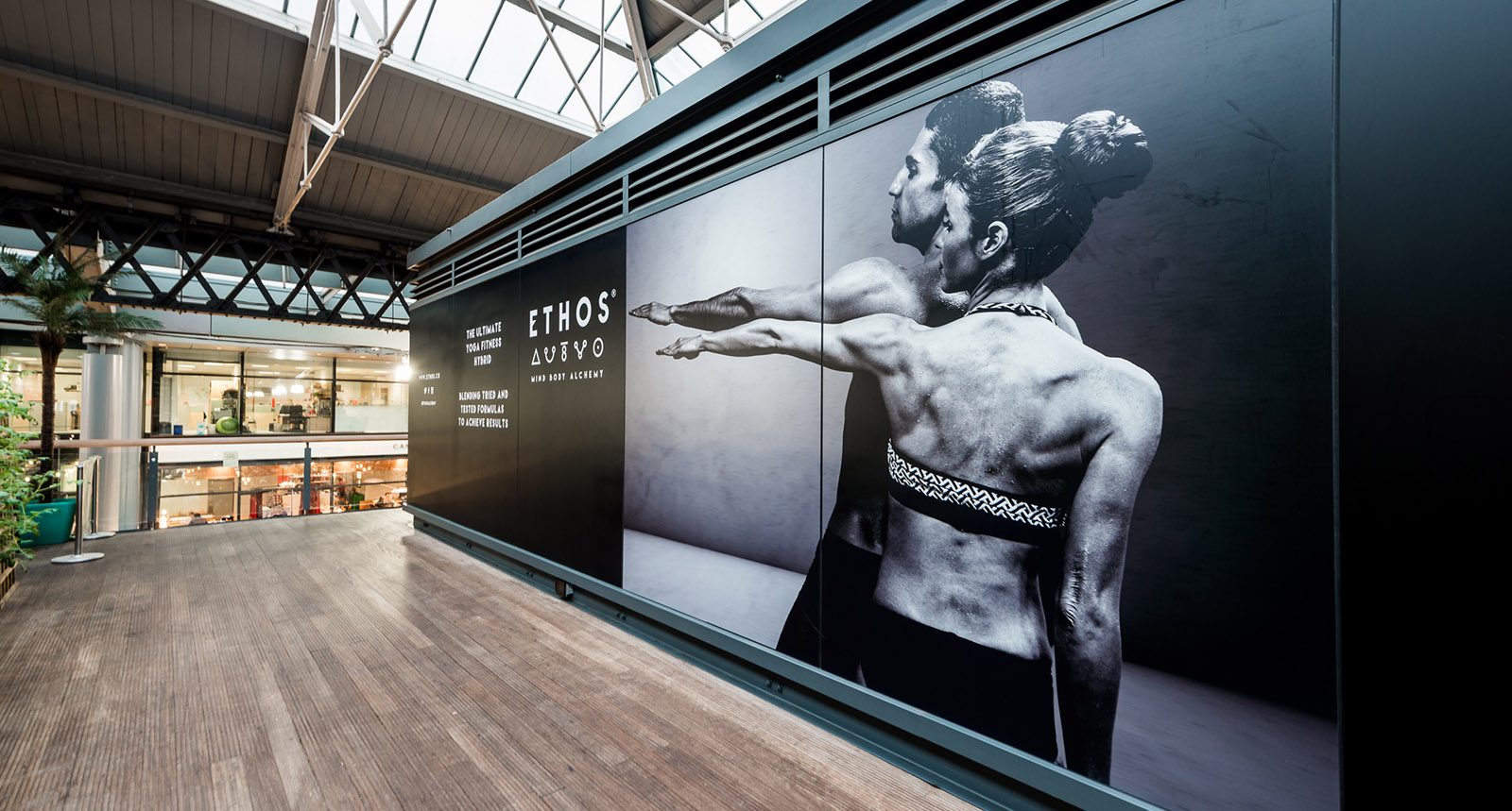
The printed expression uses organic paper and kraft textures with embossed, stamped logos and a light gold leaf accent. Bold branded vinyls in large scale created a buzz and drew people to the site ahead of launch.



A confident identity for a standout London launch.