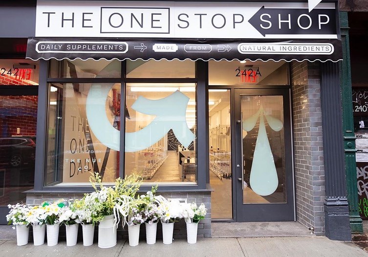
The Nue Co makes supplements that behave like a considered beauty brand, honest, design led and free of the clinical language of the category. We worked with them in New York across two connected briefs: a modular retail merchandising system that could scale into wholesale and department store space, and a temporary flagship pop-up that put the brand story on a SoHo street corner.
“Take the honesty of a corner store and give it the confidence of a beauty hall.”
Supplements are usually sold in one of two ways: the sterile pharmacy shelf, or the overwhelming health store wall. The Nue Co needed a retail language that felt as designed as the product, worked as a standalone destination and translated cleanly into concession and wholesale space.
We built the concept around a single, ownable idea, the daily supplement as an everyday essential. The One Stop Shop borrowed the visual codes of a New York bodega, the awning, the arrow signage, the flowers on the pavement, and reframed them in the brand's stark black and white palette with oversized graphic marks.
Before the pop-up, we designed a modular merchandising system that could hold the brand together wherever it appeared. Three tiers of display unit, engineered from a shared kit of parts, let the brand scale from a single counter plinth to a full collection wall without losing its identity.
Compact hero displays for a single product story, sized for concession counters and till points.
Freestanding play tables and shelving that invite handling and testing across the core range.
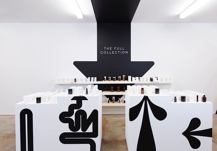
A complete collection system for flagship and pop-up space, holding the whole range with clarity.
“Daily supplements, made from natural ingredients. The whole brand, said on an awning.”
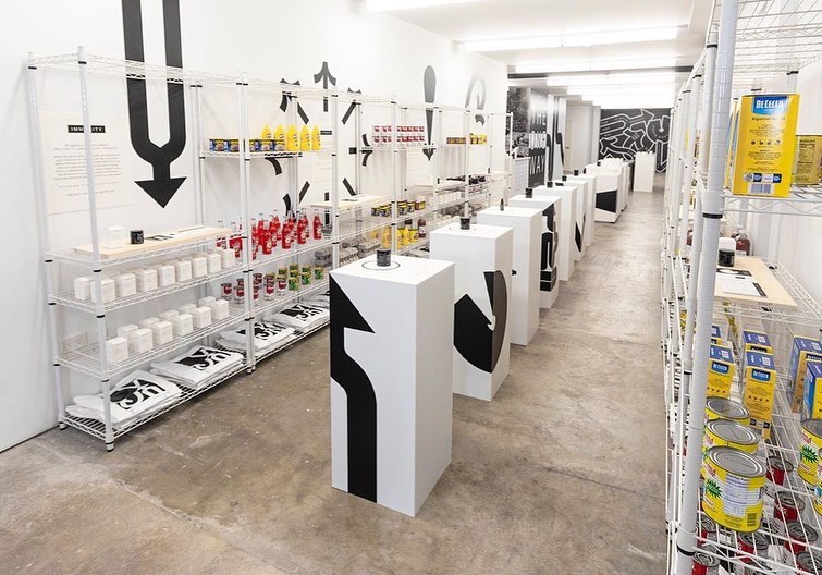
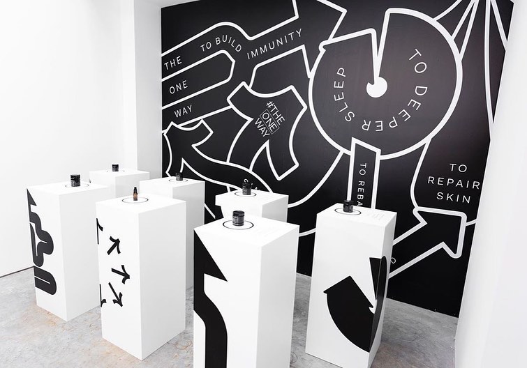
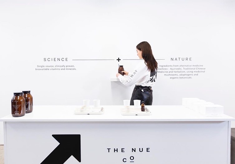
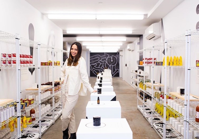
The SoHo pop-up turned the concept into a place. A branded awning and arrow signage read instantly as a neighbourhood store, while inside, a bodega style layout on wire shelving organised the range by daily ritual. Oversized black arrow graphics ran across white plinths and walls, a testing bar drew the science and nature story out for visitors, and a full collection wall let people shop the entire range with clarity. The result was a store that looked like it had always belonged on the block.
“Designing for short term attention is a different discipline to designing a flagship built to last for years.”
A pop-up has to earn attention and engagement in a compressed window, so it shows up differently to a permanent store. The job is impact and clarity in the first few seconds, not the slow, layered detail you build into a flagship meant to reward years of repeat visits.
The One Stop Shop was a bold, instantly legible expression of the brand that stopped people on the street, and it was executed in a considered, thoughtful and cost efficient way. Bold graphics, a simple kit of parts and a sharp idea did the heavy lifting, proving that a temporary space can feel just as designed as a permanent one.
One design language, from a single counter to a New York street corner.