
Potência Leblon is feminine strength, elevated through elegance and movement. Built end to end with SheridanCX, it fuses the warmth of Brazilian heritage with the poise of Lisbon: a brand identity, a retail concept and a Wolffit Pilates studio under one roof on Rua do Salitre, off Avenida da Liberdade. One address, two engines: a store that reads as an editorial arena of jewellery, scent and fashion, and a studio that runs on rhythm and community.
“This is where power lives, where presence sharpens, and where women set the energy.”
For women, by women. We positioned Potência as a stage for ambition, style and connection, not a shop with a gym attached, but a single cultural destination where getting dressed, getting strong and belonging to something are the same ritual. The name means “power”; the strategy made that legible in every decision.
The store is the editorial arena, jewellery, scent, activewear and fashion, merchandised with intent. The studio, home to the Wolffit method, is the engine of intensity below. Together they create rhythm, community and cultural confidence, giving members a reason to arrive daily and shoppers a reason to stay.
Before the mark was set, we explored three identity directions, each a different reading of feminine power. All three drew on the same brief, Brazilian heritage carried with Lisbon poise, and diverged in tone: composed prestige, angular precision, and bold energy.
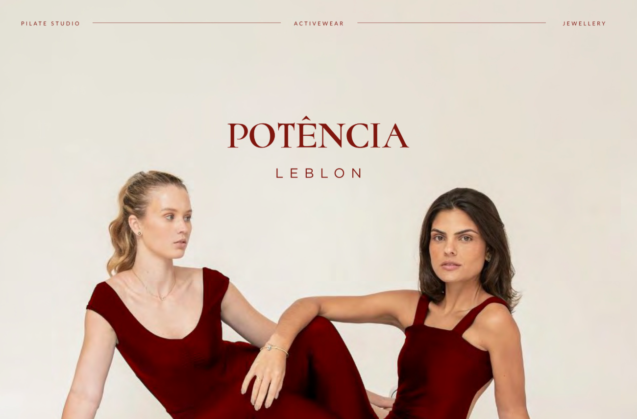
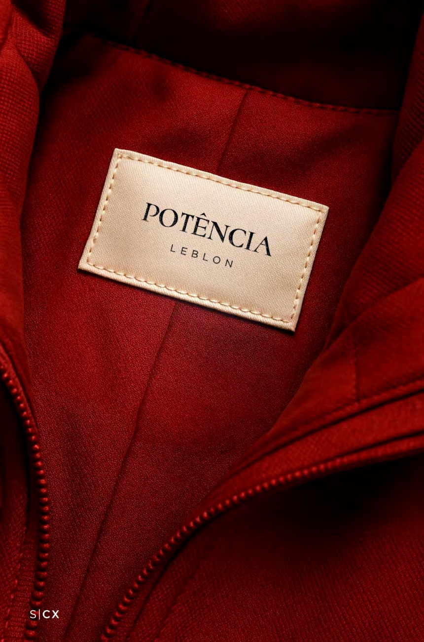
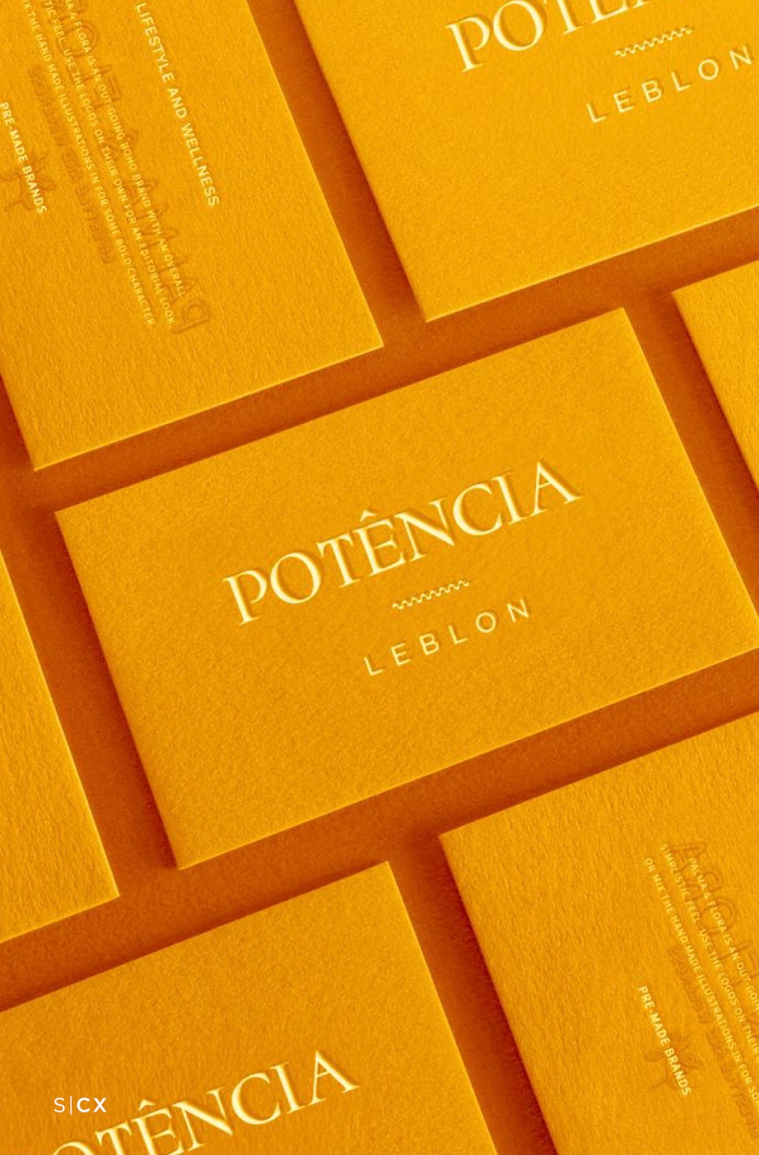
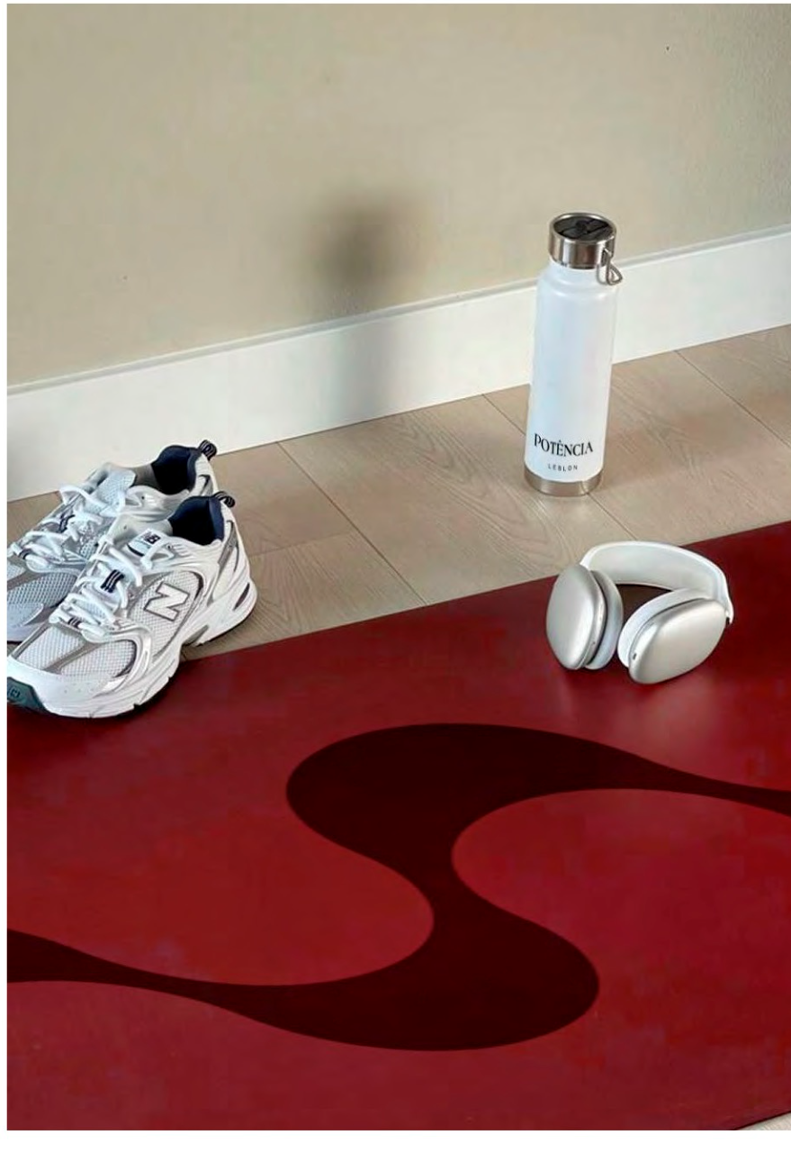
A refined serif lockup with fine stroke contrast and generous spacing, set on a grid built from Rio's Copacabana pavement wave, the wave reappears on cards, mats and liners. Symmetry and restraint give it a timeless, luxury weight, the direction we carried through into the store.
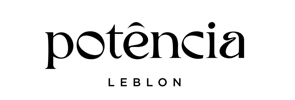
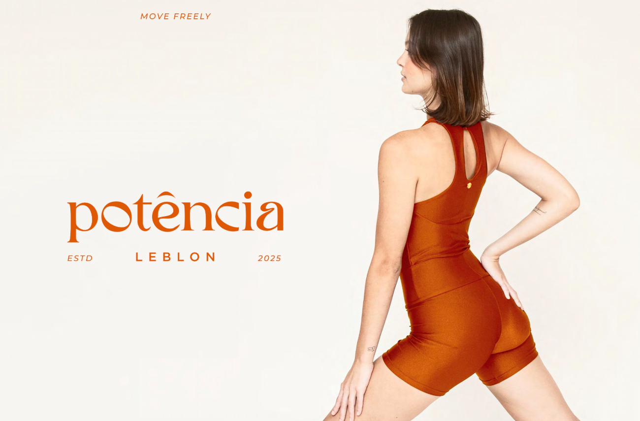
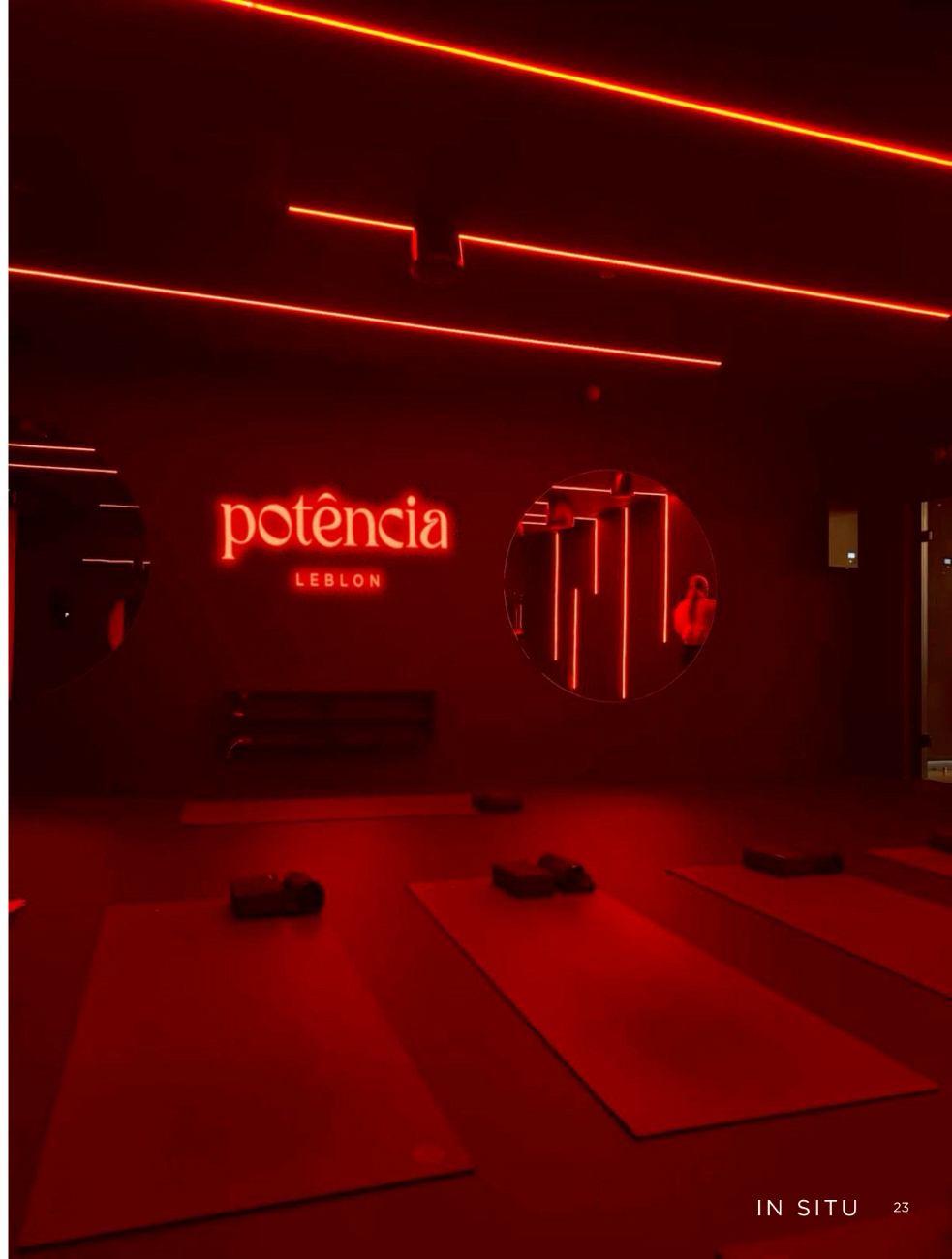
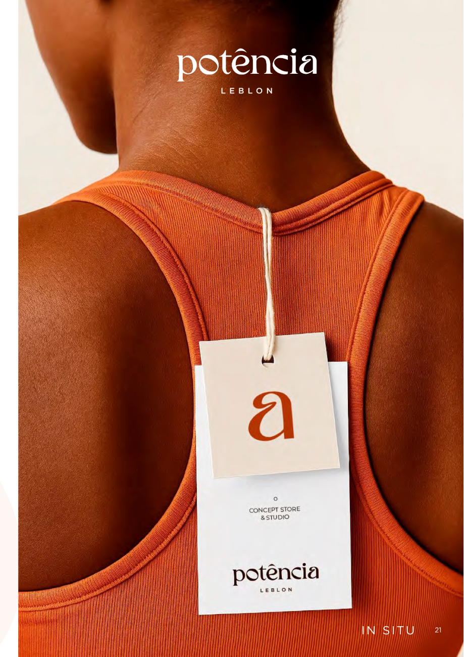
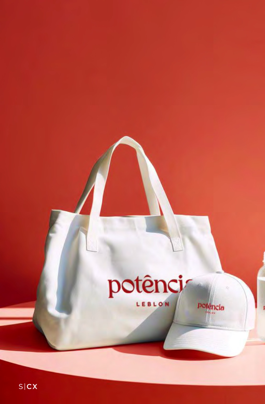
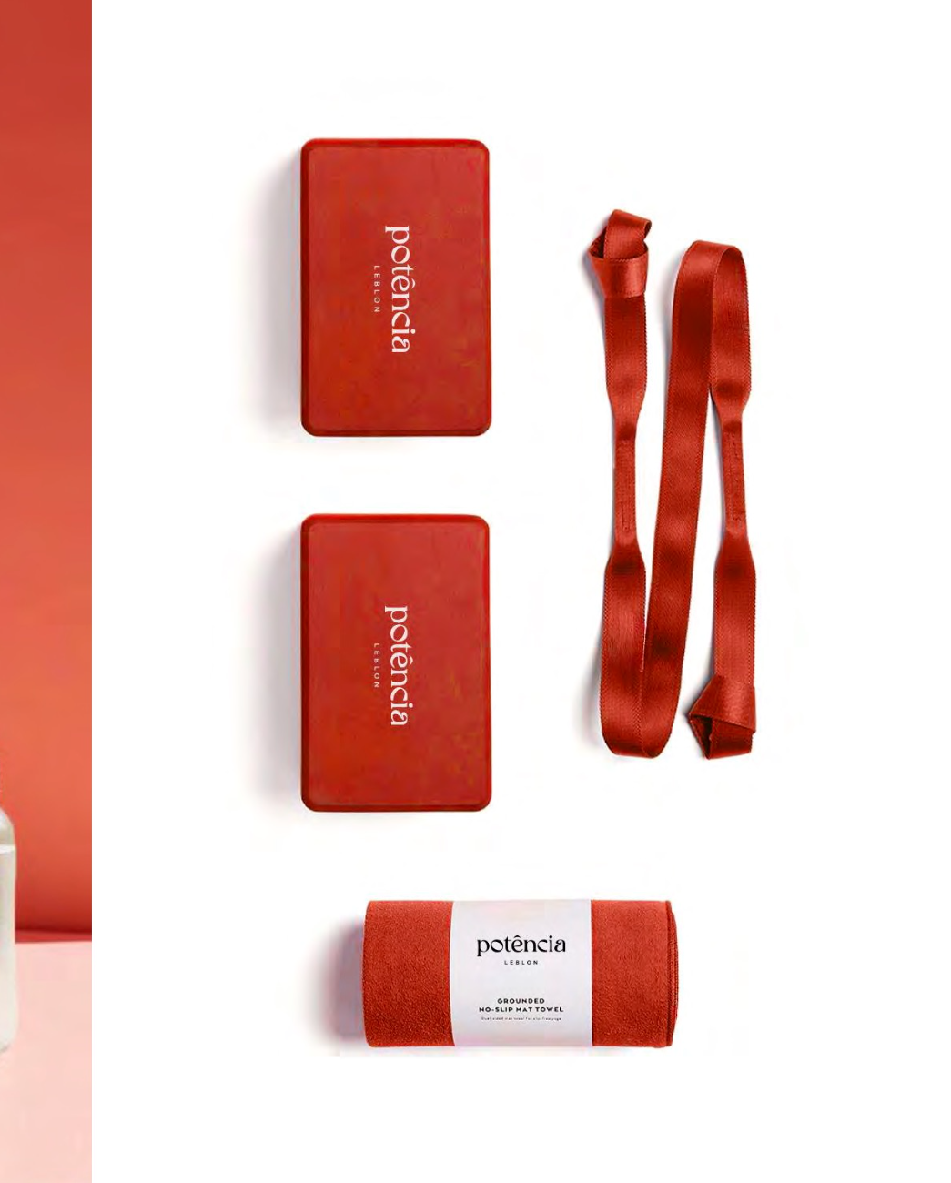
A modern Art Nouveau logotype: controlled whiplash curves and variable stroke contrast on select glyphs bring a fluid, kinetic rhythm, strength and femininity held in the same mark. It glows as neon in the studio and prints crisp on cards and merch.
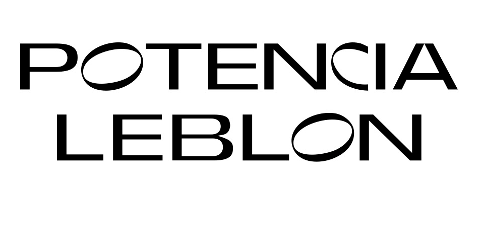
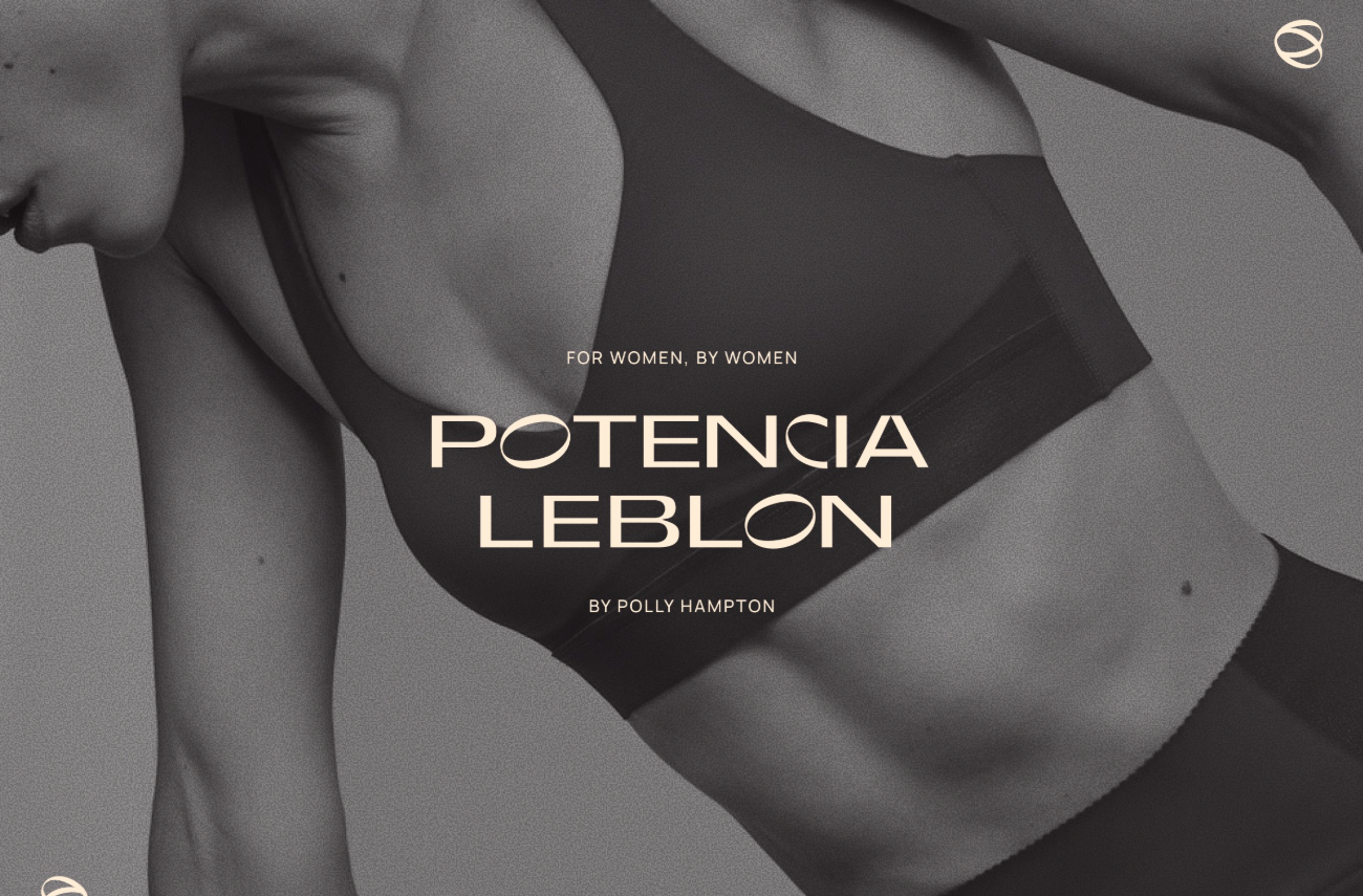
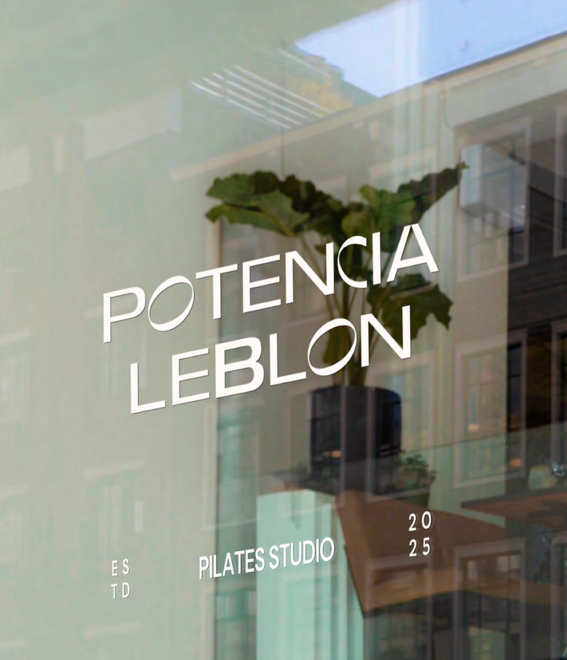
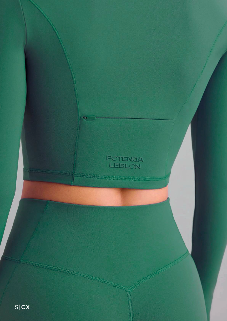
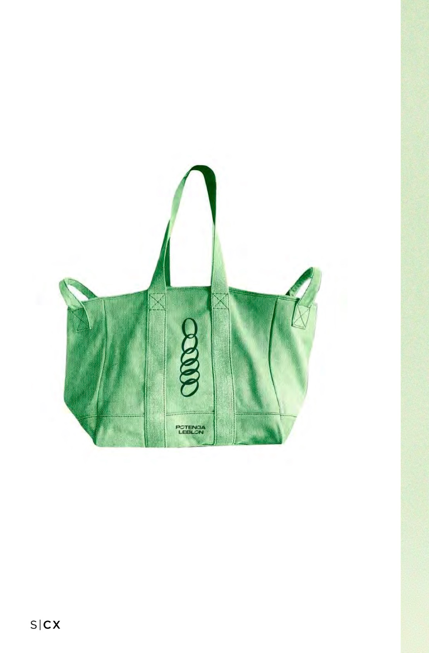
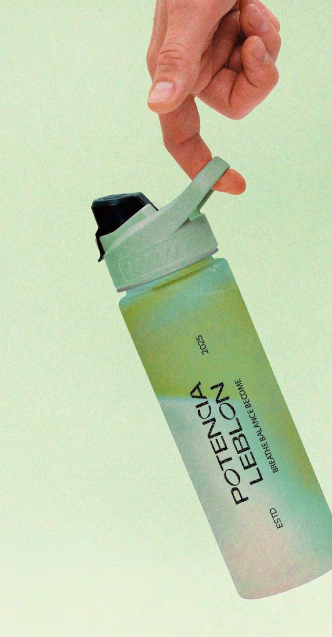
A geometric wordmark anchored by a sculptural “O”, echoed in a stacked ring monogram symbolising strength, balance and unity. Varied line weights carry movement and modernity into a distinctive, memorable mark.
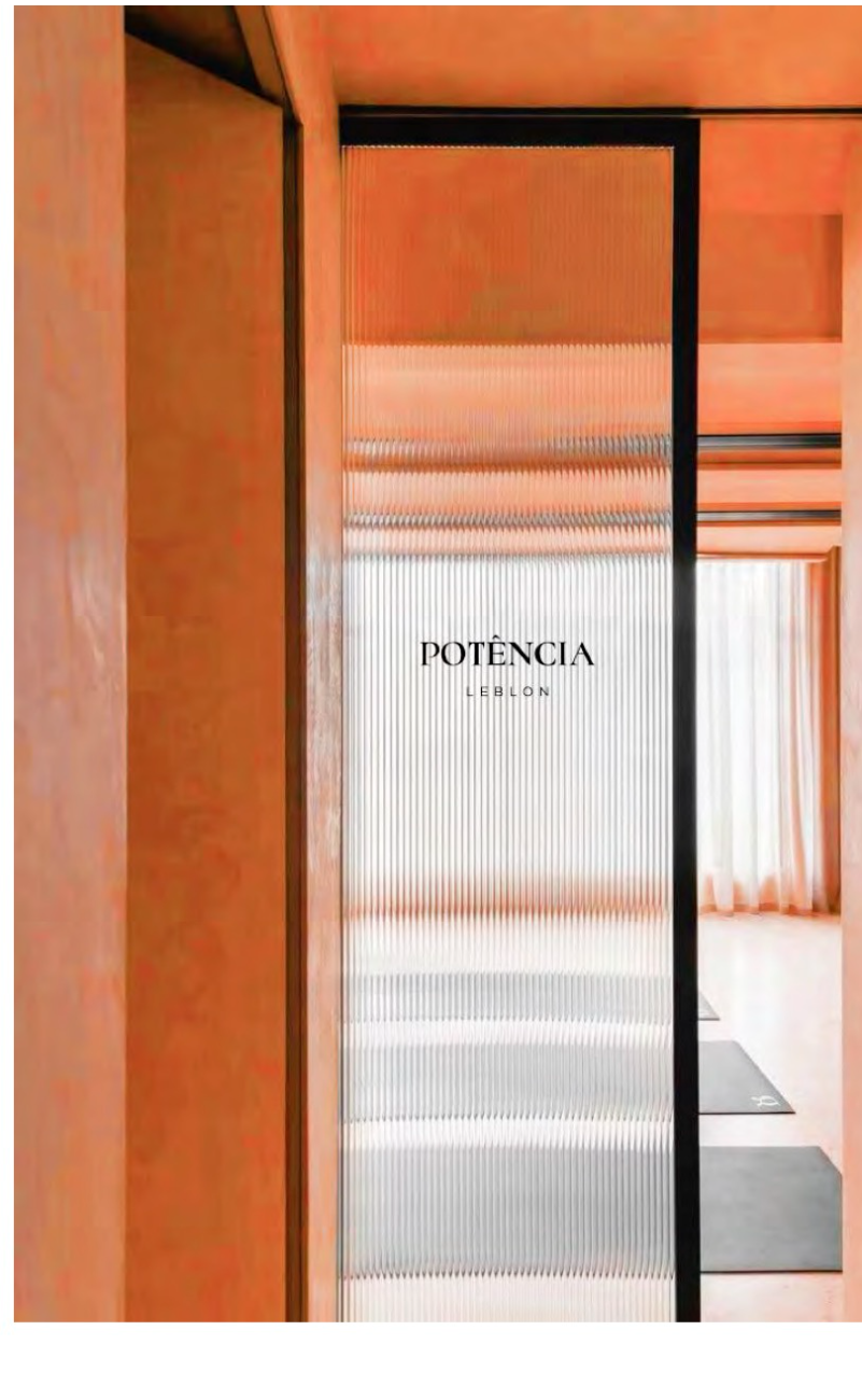
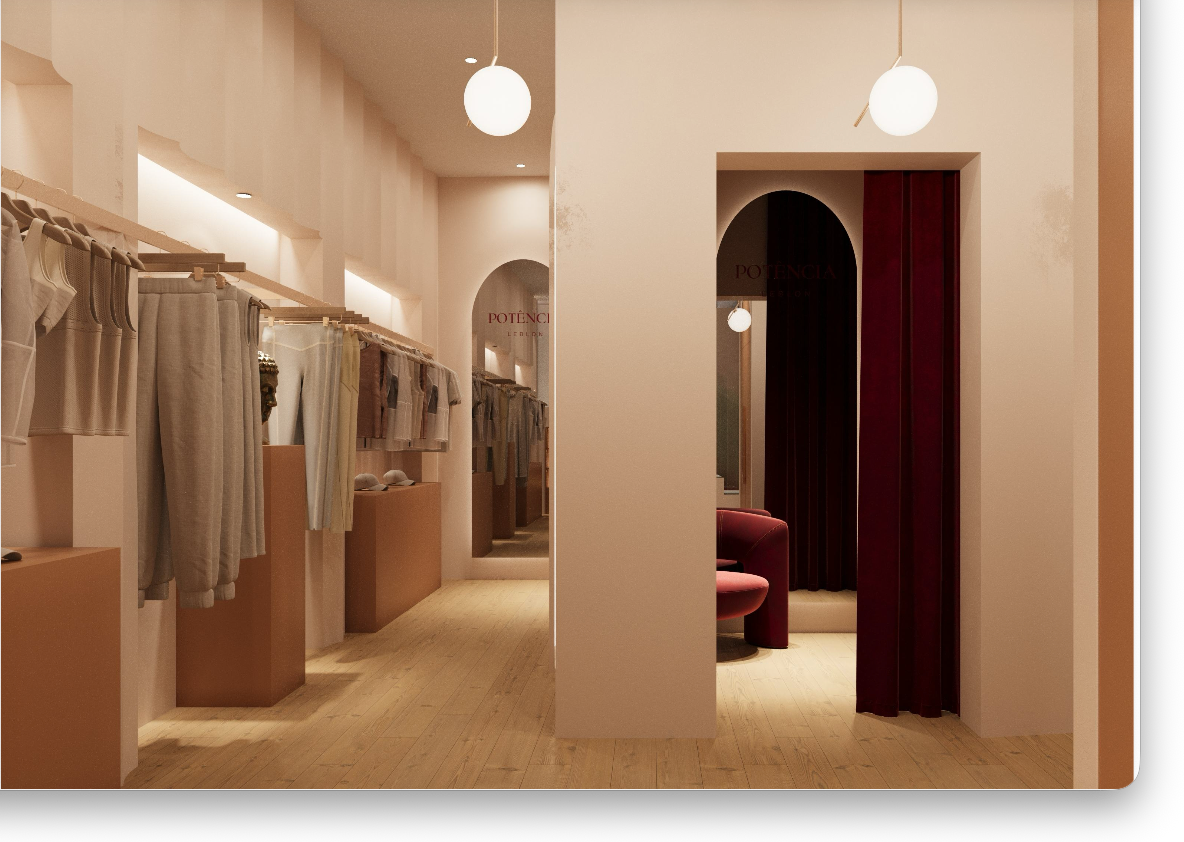
Modern, Art Deco, curved. A warm shell of plaster and terrazzo, punctuated by one unmistakable gesture in red.
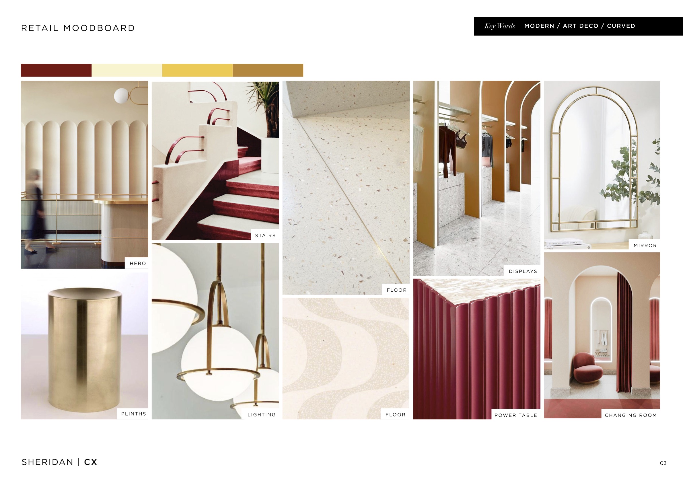
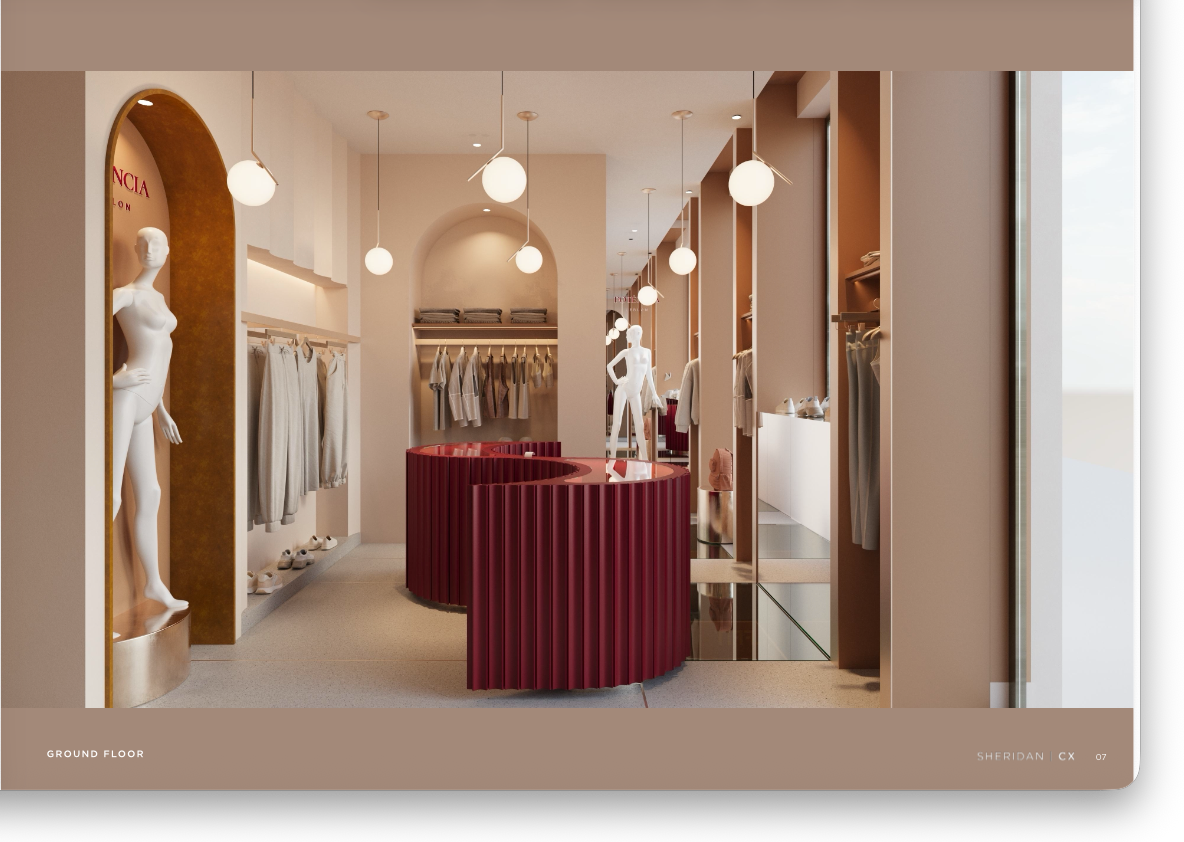
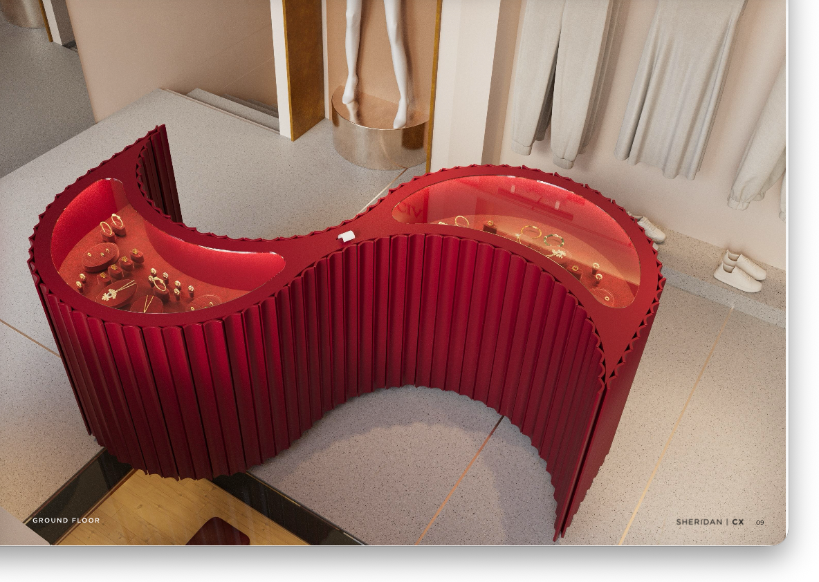
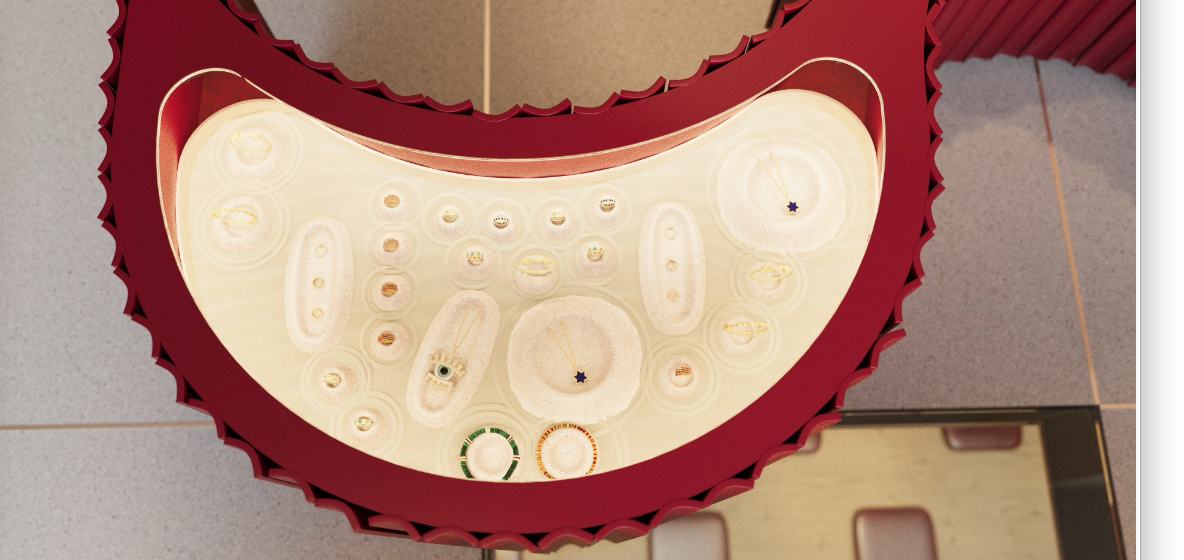
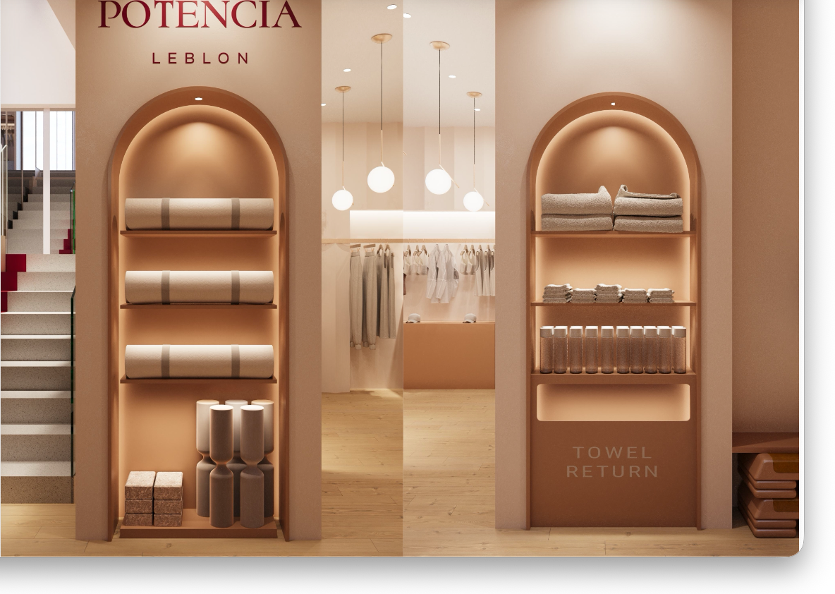
The customer journey moves in seven movements, beginning on the ground floor: The Pull at the street-facing window, The Shift as she crosses the threshold, and The Mood, where the floor is zoned by feeling rather than category, Energised, Grounded, Empowered. Arched niches frame the merchandise like artworks; a hand-fluted, powder-coated red “power table” curves through the centre as the gravitational heart of the store, its glossy top revealing a cabinet of fine jewellery.
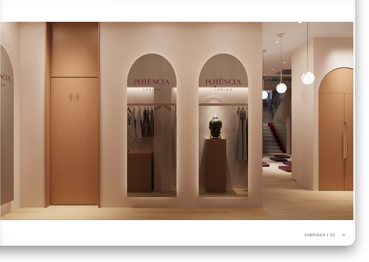
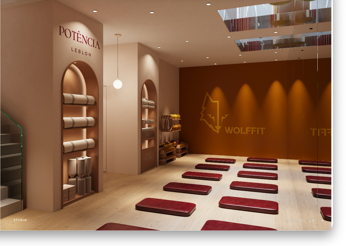
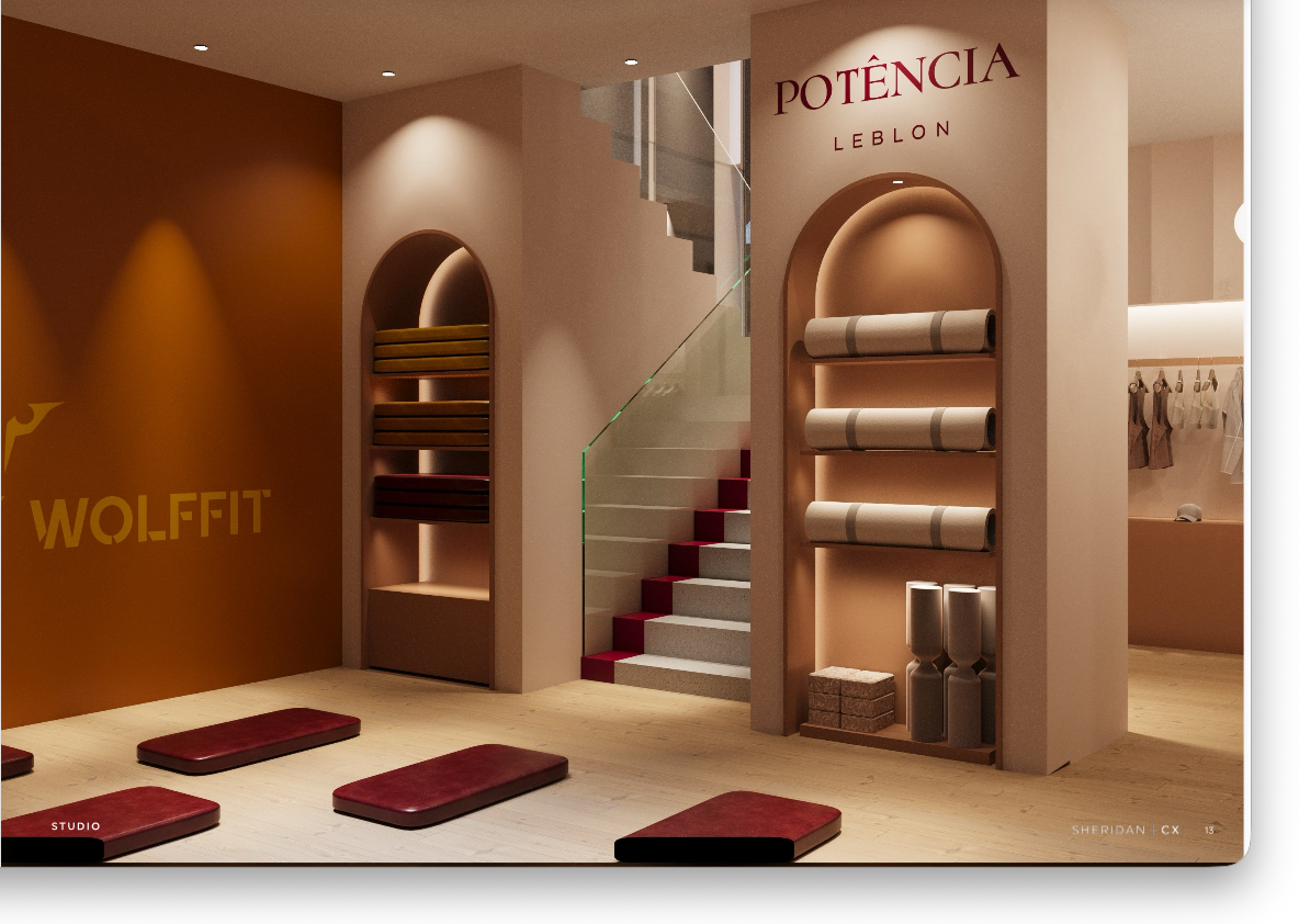
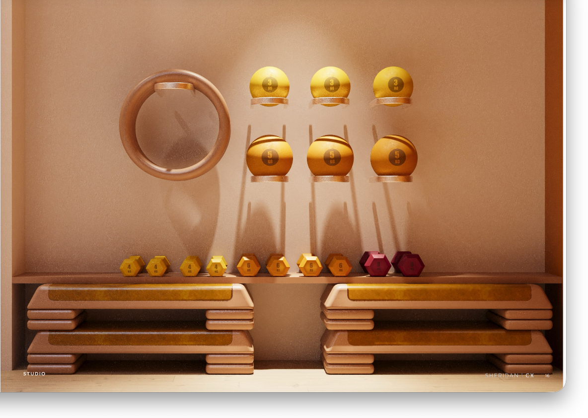
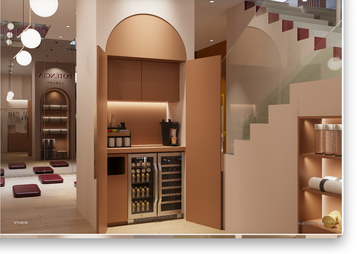
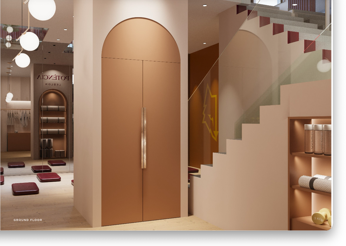
Beneath the store is The Beat: the Wolffit studio, whose elite Pilates method is Brazilian-rooted and Lisbon-charged. The same warm plaster and brushed gold continue underground, softened with deep red mats and gilded apparatus, so the workout reads as an extension of the brand, not a back-of-house afterthought. The journey then closes above, through The Expression (styling the self across jewellery, scent and movement), The Capture (post-class, when confidence is at its peak) and The Close at the counter. A café and juice bar tucked beneath the stair keeps her lingering between movement and retail.
One destination where women arrive to move, to dress, and to belong.